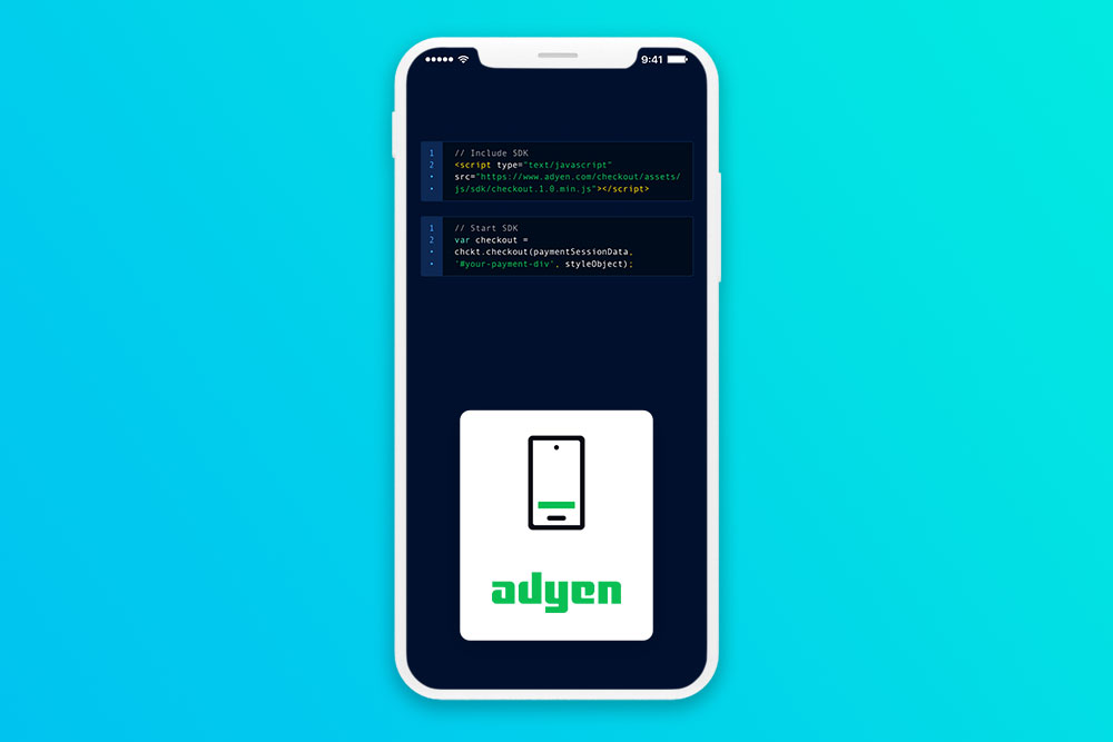
Adyen SDK
Designed the app experience for the sales team to use as a tool when working with prospects.
Goals & Challenges
The team wanted to increase Adyen’s business by creating a seamless payment experience in the Adyen SDK. This way, current merchants and prospects will see the value add in integrating with Adyen.
The key challenge is staying within the iOS native UI elements. This request is from the product manager so that we launch fast and iterate from the first version.
Measuring success
When the SDK is integrated, I would measure the success of completed checkout rates. Another way to measure the success is also the frequency and ease of use. A good SDK will decrease TTV (time to value) which is how long it takes for a new customer to be beneficial.
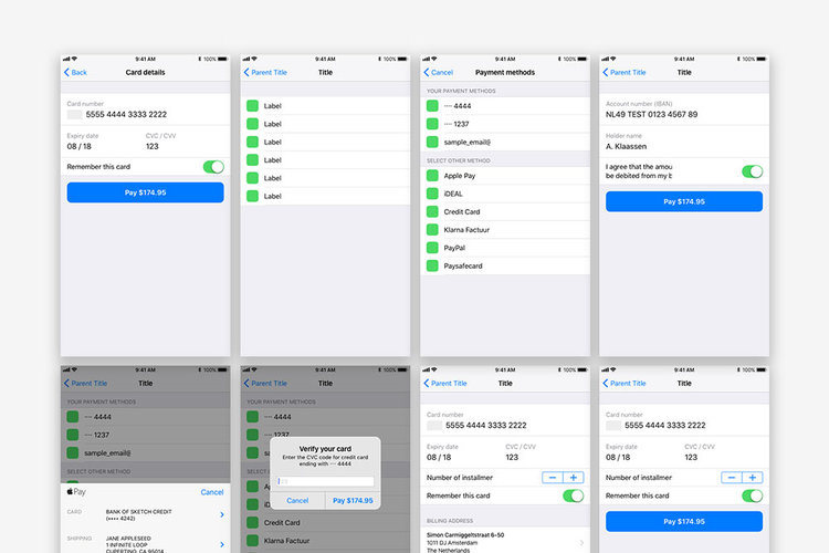
Beta v1
When I recommended to be a part of this project, the user experience team had started to work on a flow already. The constraint that they had was sticking with the native iOS elements, but after discussion on building on top of native iOS design patterns, we had some room to expand the project visually.
My Trello process
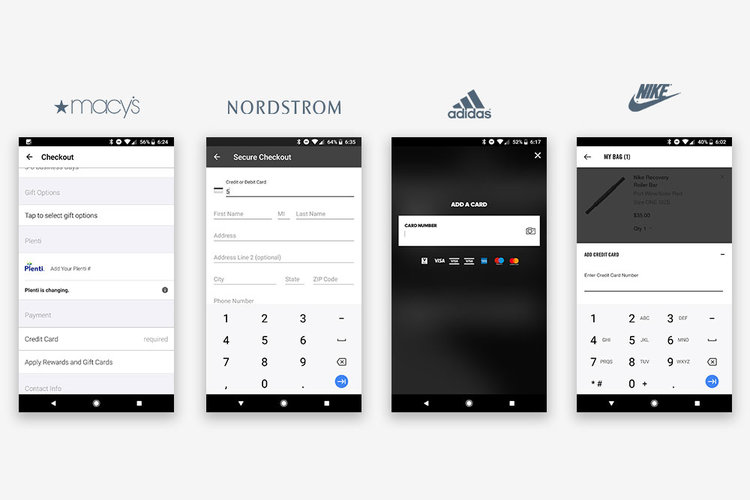
Competitive analysis
By analyzing top mCommerce apps such as Nike, Adidas, Nordstrom, and Macy’s, findings were that there are many steps to update an account’s payment information. From browse to completing the purchase, there were too much clutter, noise, and distractions. The best experience is an invisible one, like Uber and Lyft. That’s what I aimed for.
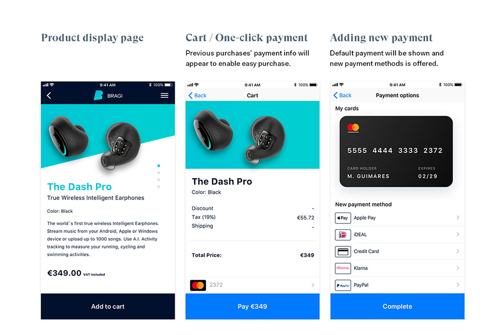
Possible solution flows
After researching through some apps, it was clear: the flow of making a purchase was just too long. Consumers want to make purchases quick and easy. Here is a possible solution with simplified steps in a purchase flow.
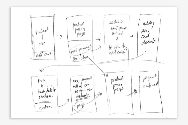
Building shortcuts
Even after creating a simplified flow, we can further find similar interactions and create a more streamlined and useful user journey by reducing steps, increasing usefulness, and adding value.
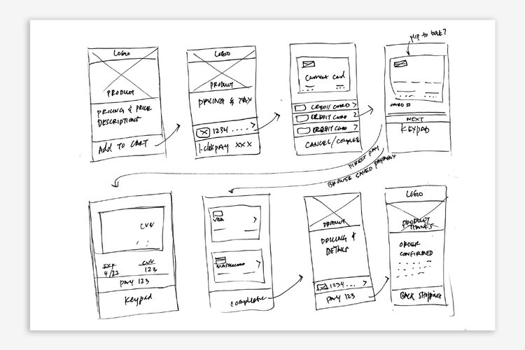
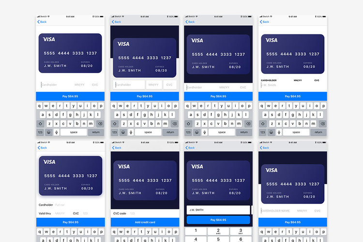
Details build the big picture
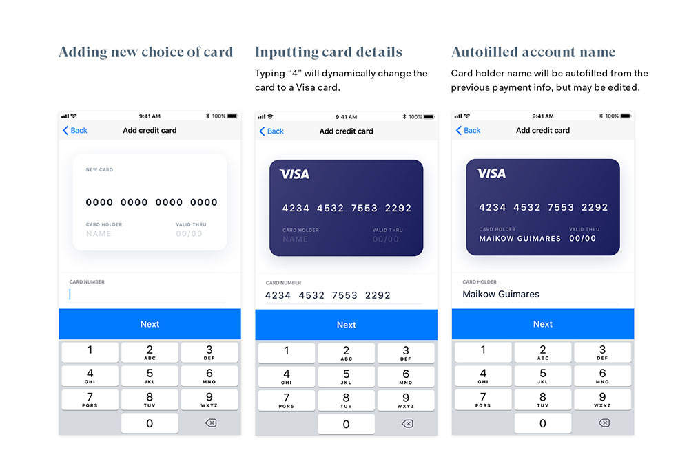
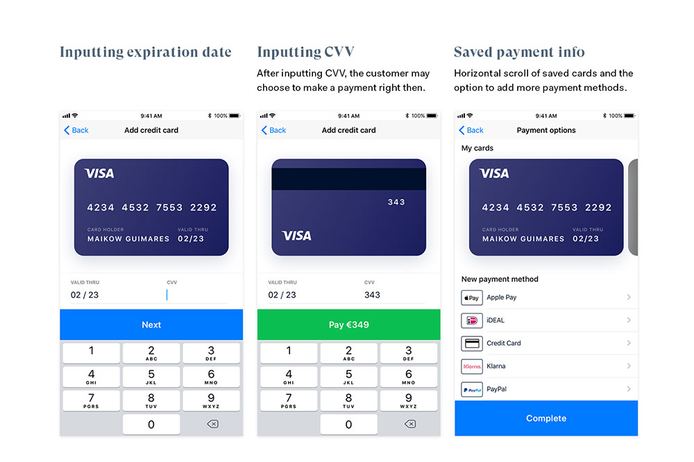
When going from wireframe to executing the user interfaces, this is where we explored the divergent and convergent process. What makes adding a new credit card easy?
- Pre-filled information from previous added card, like cardholder name
- Adding information one step at a time, removing friction and frustration
- Small interactions like starting card number at "4" will be automatically turning the card blue for Visa branding and "5" for MasterCard branding
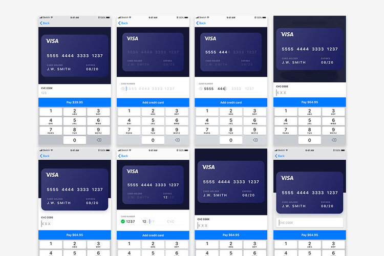
Adding a merchant skin on top
After explorations and the final design solution (prototype here), we added a merchant skin (branding).
Conclusion
What I would have done differently is involving Android as well, but since the priority was iOS, that was our point of focus. Being more involved in the early stages with external user testing and research to refine this project would make design choices easier. I would have loved to see the data of this project after launch as well.
By analyzing the current standards in making an online purchase, we can further simplify the process by removing friction to improve the checkout experience, balancing innovation and standardization.