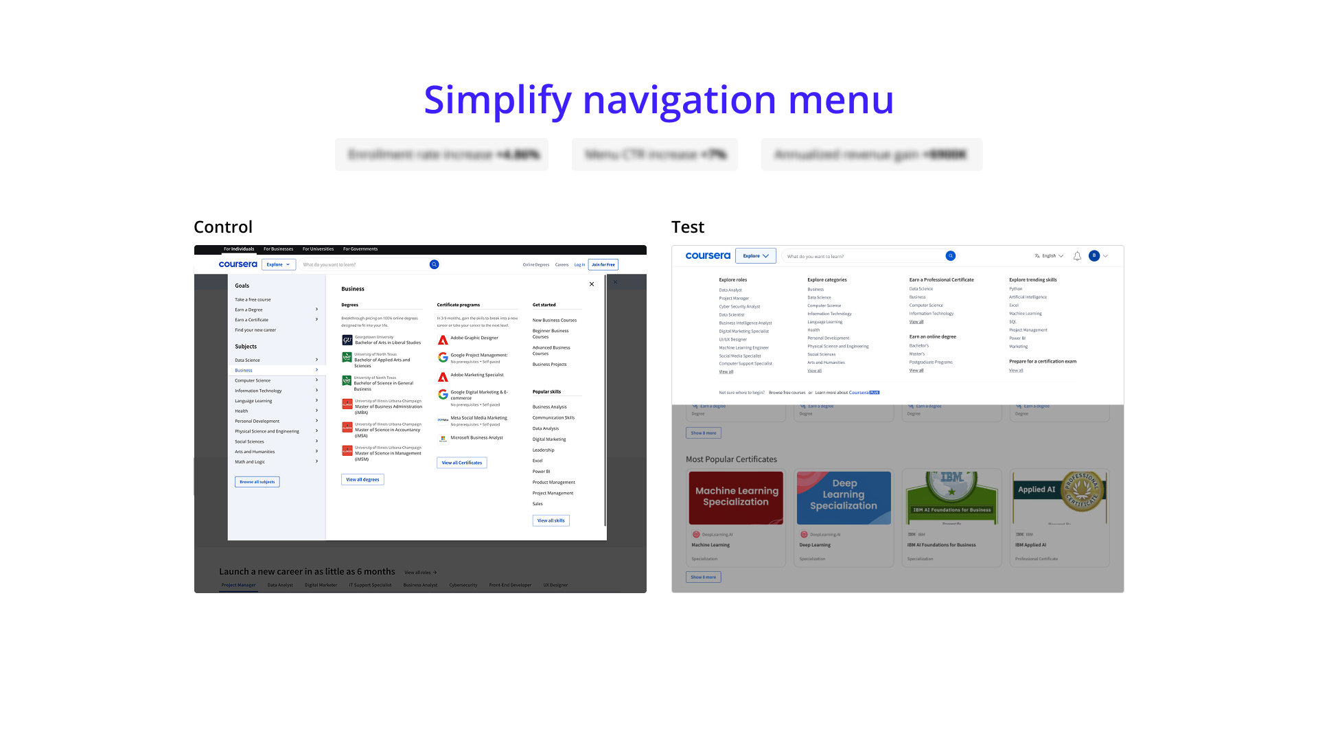
Reimagined Discovery: from component to company strategy
How updating a product card changed the platform, the company organization, and the future of Coursera
The origin
Initially scoped as a redesign of Coursera's product cards, this project evolved into a much larger opportunity. Through research, my co-lead Michelle Claessens and I uncovered a foundational shift that could transform the experience from a simple refresh into a fully reimagined product.
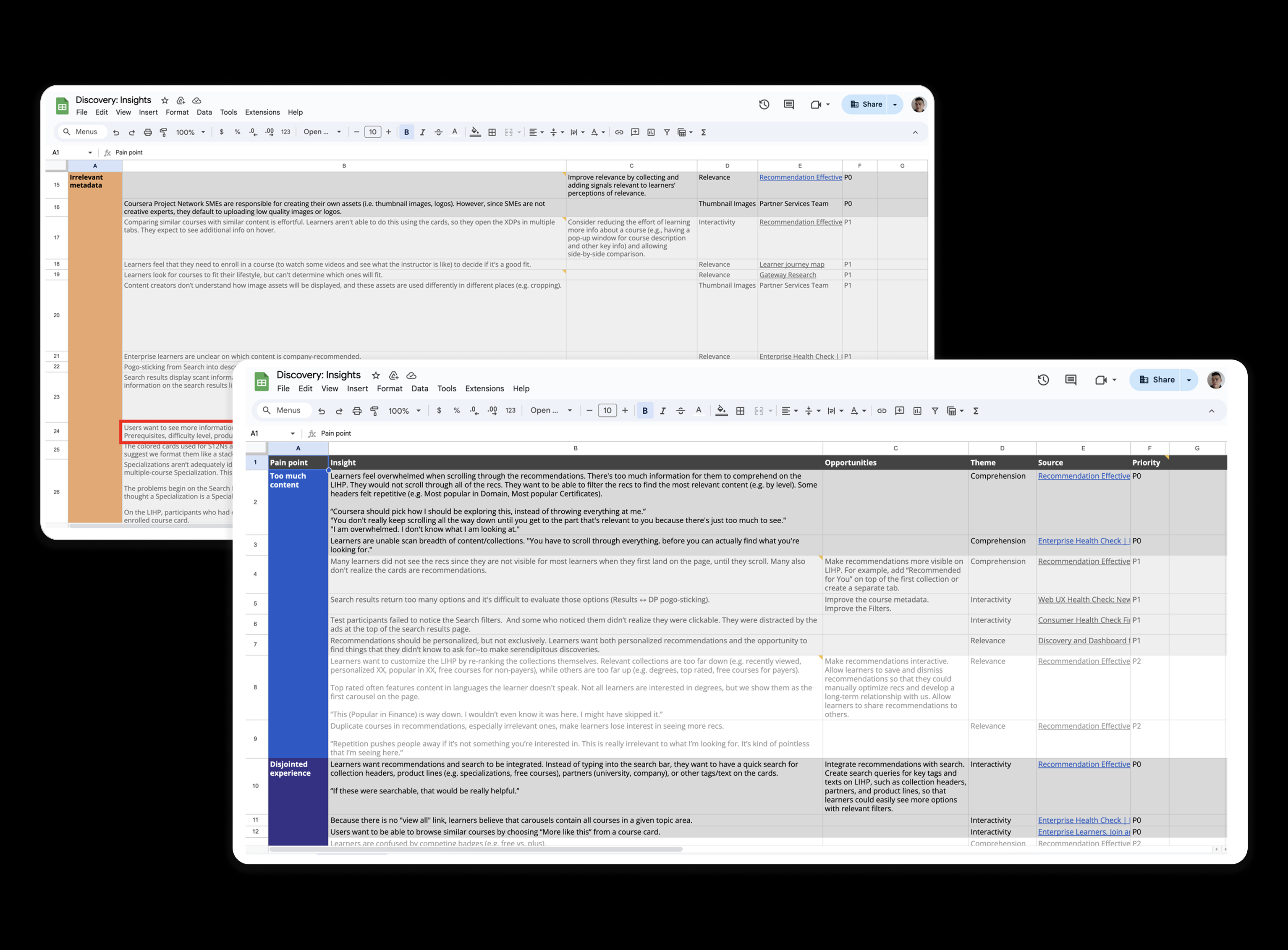
User insights from research
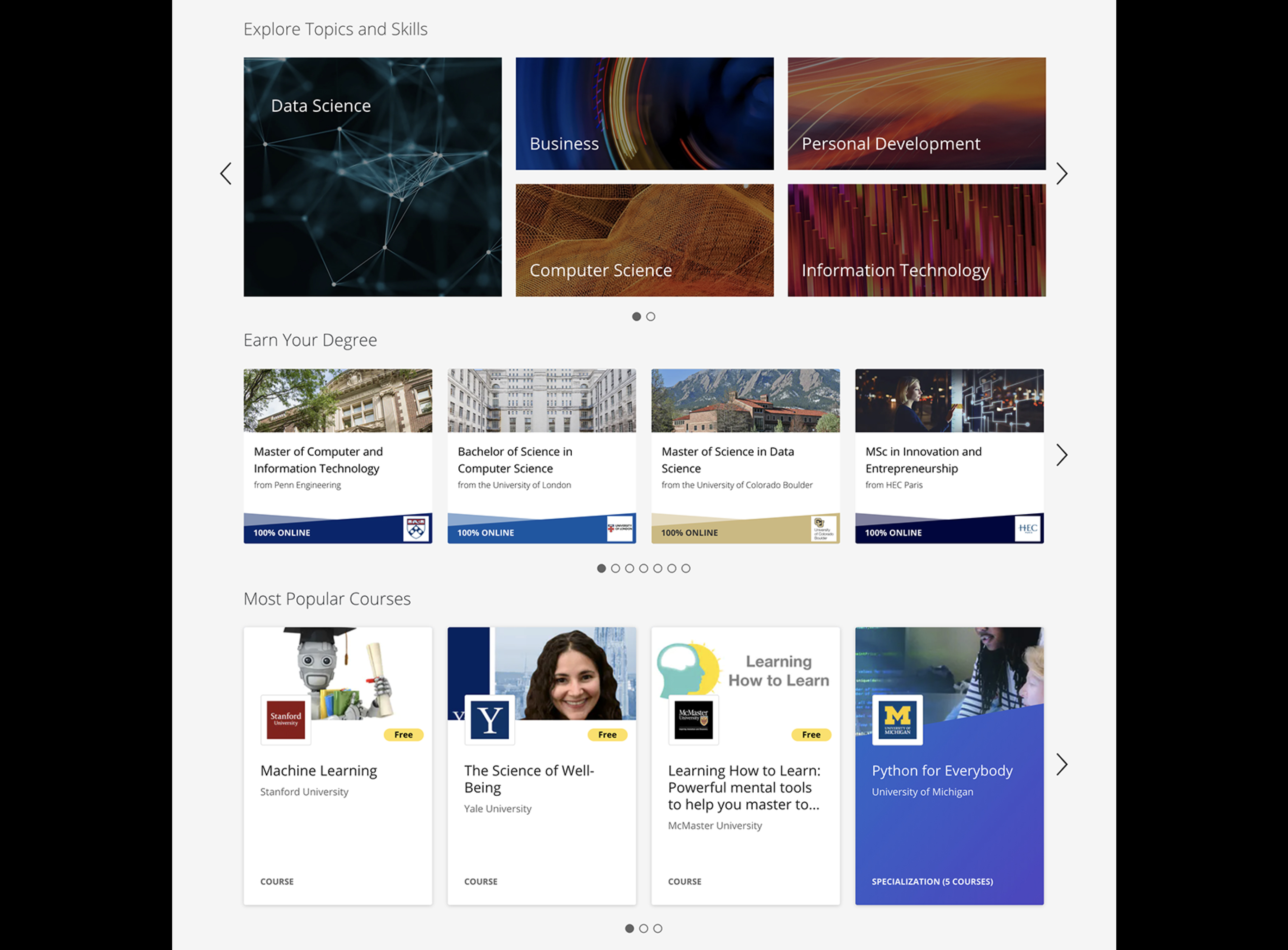
Product cards at Coursera 2020
Key findings
Finding 1 — Decision fatigue. Learners could not decide and differentiate from each course in a given collection.
Finding 2 — Product perception is skewed. Learners could not differentiate a course from a specialization, professional certificate, or a degree.
Finding 3 — Pogo sticking is tiring. Learners mentioned jumping from tab to tab to understand each product and card of interest, causing overwhelmness.
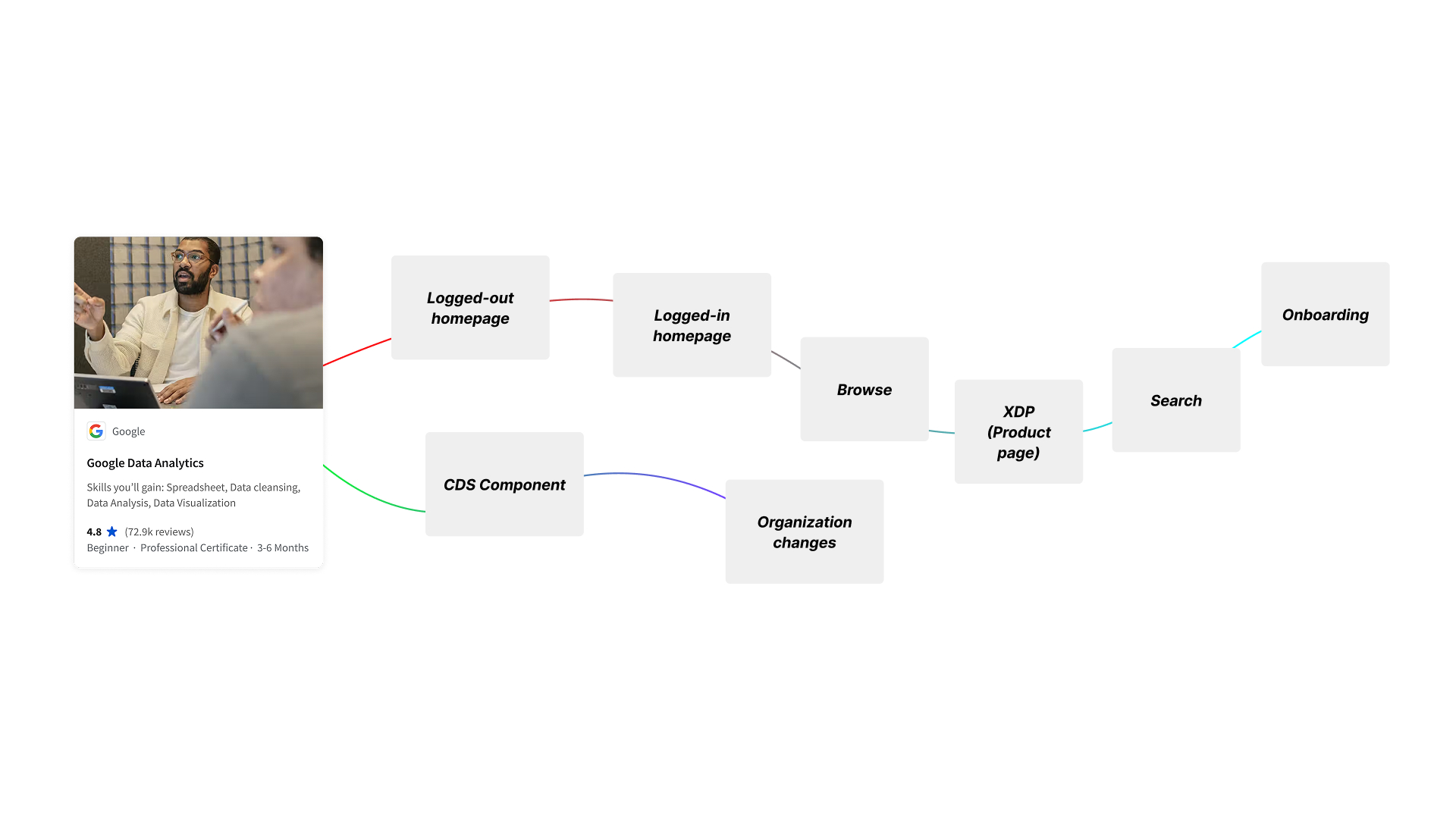
Learners lack guidance when choosing courses across key discovery surfaces (home, search, browse).
“I’m overwhelmed. I don’t know what I’m looking at.”
— Usertesting learner
Competitive landscape research for top browsing and searching experiences
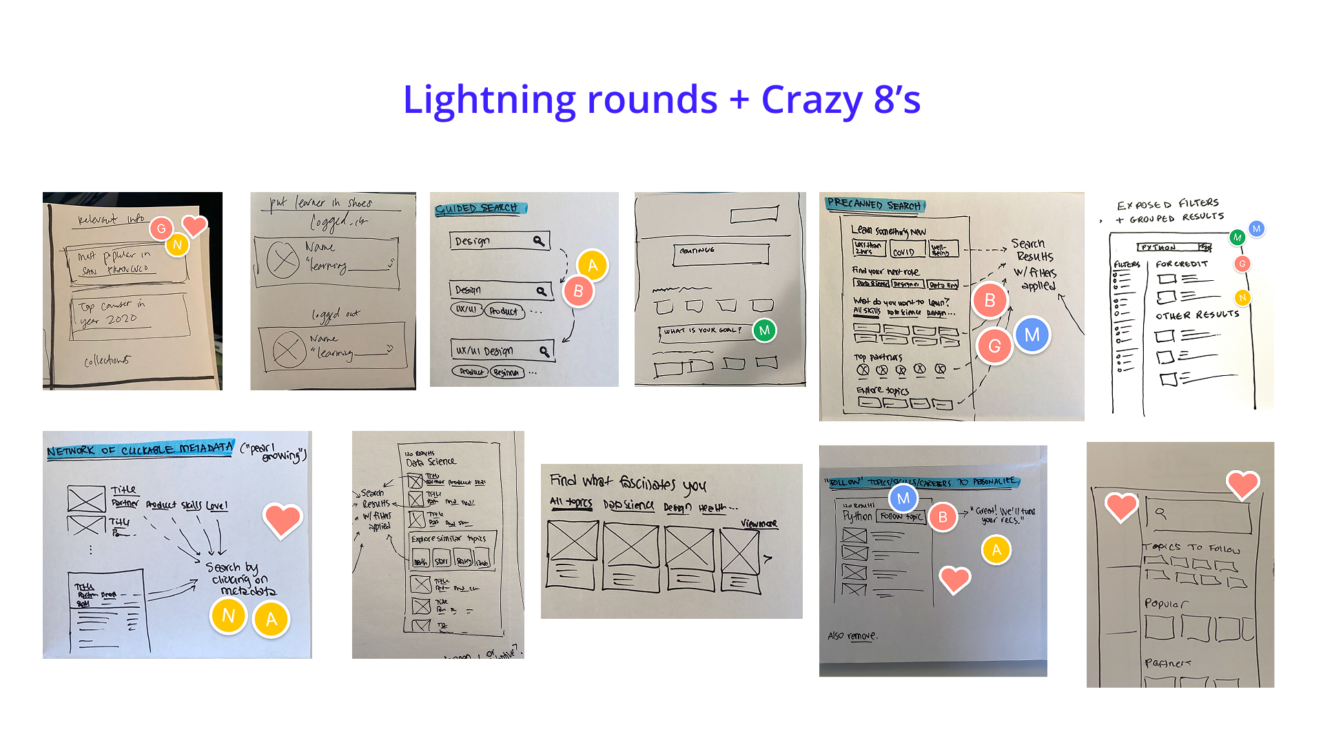
Collaborate to build on: Data -> Hypothesize -> Ideate -> Consolidate
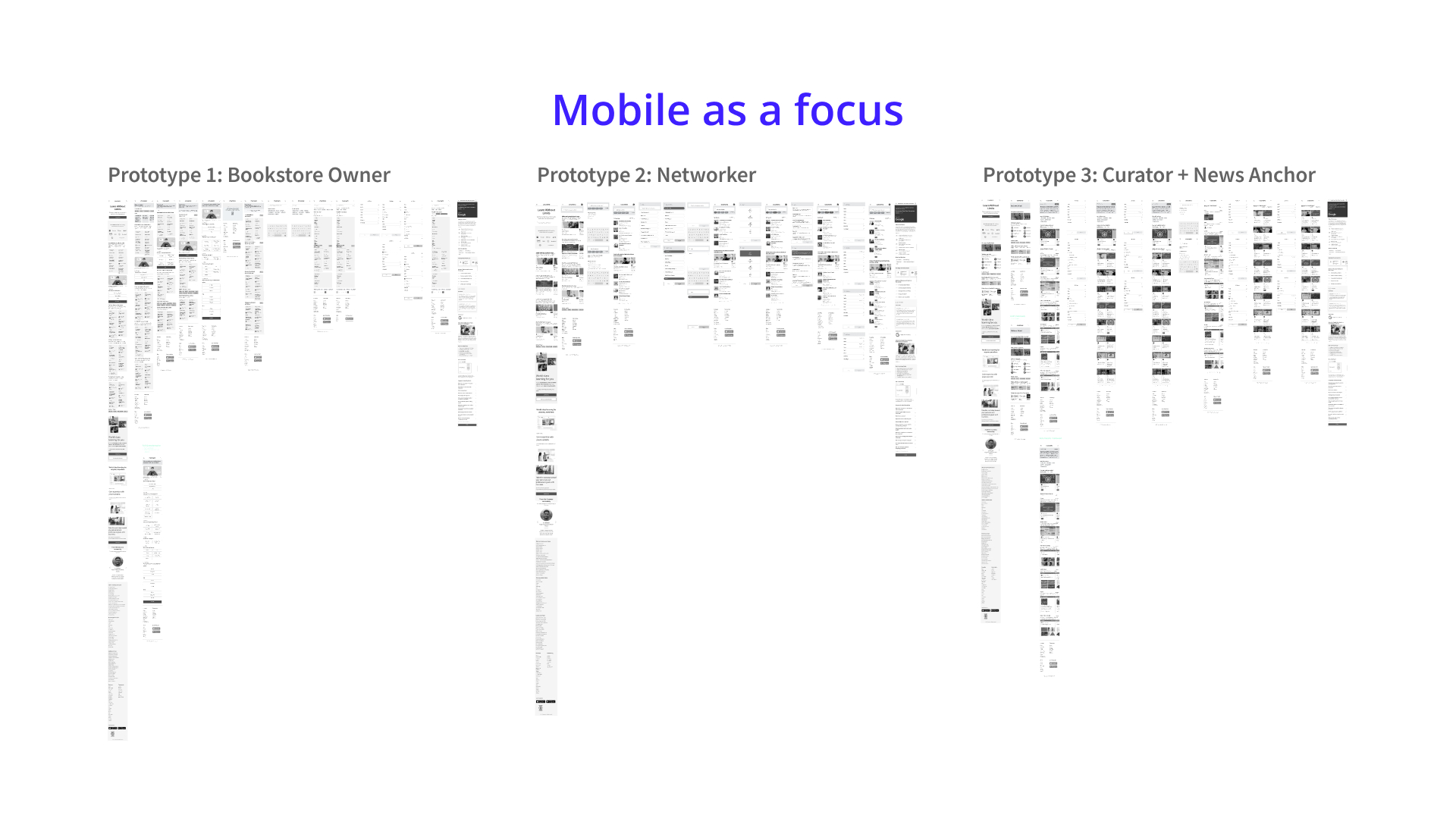
Usertesting prototype focused on mobile in India
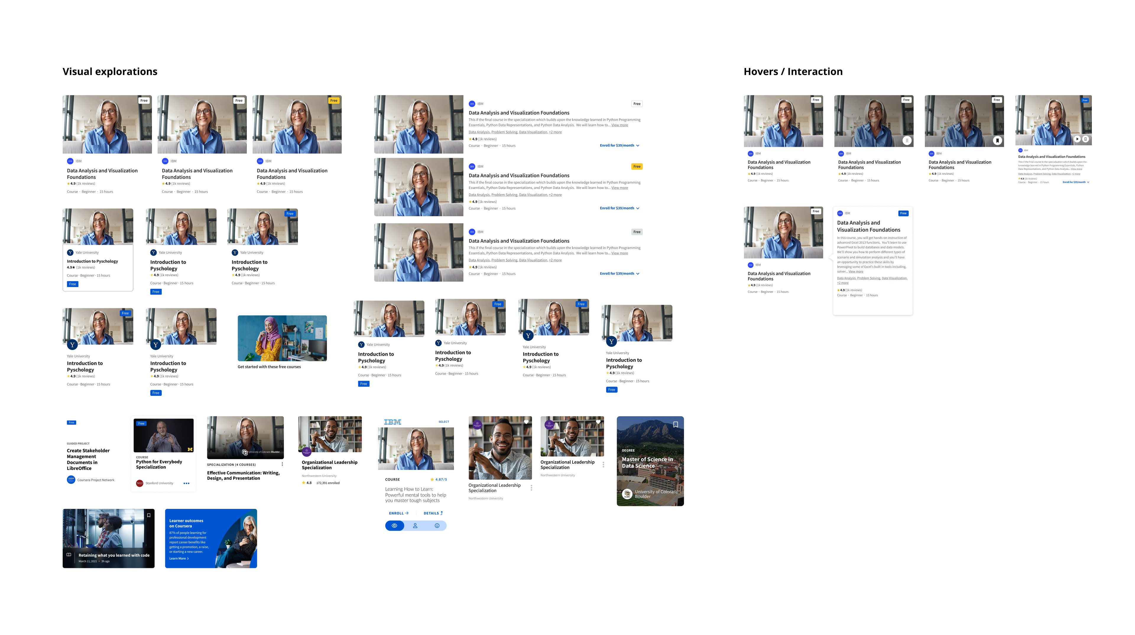
Exploring visual design during the visual sprint phase
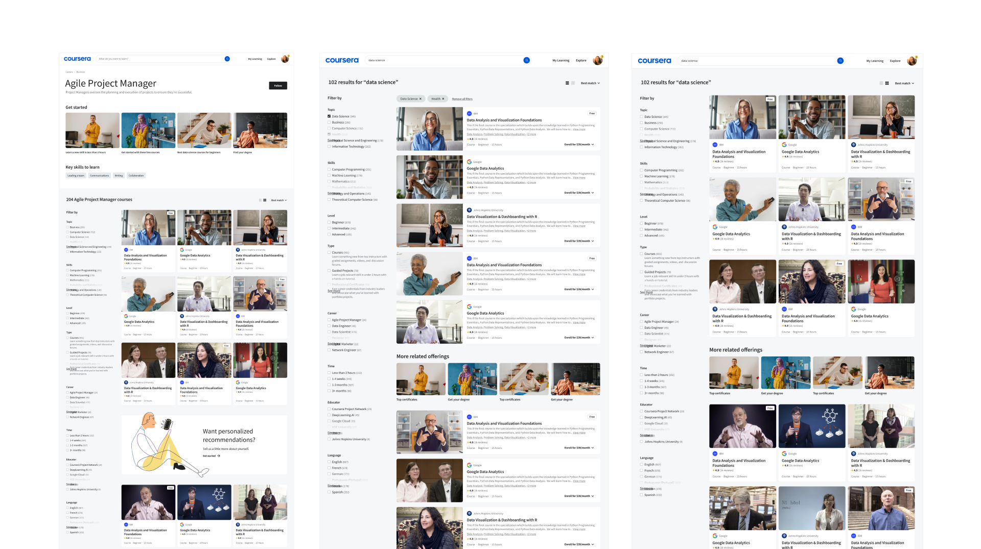
Testing cards within context of page
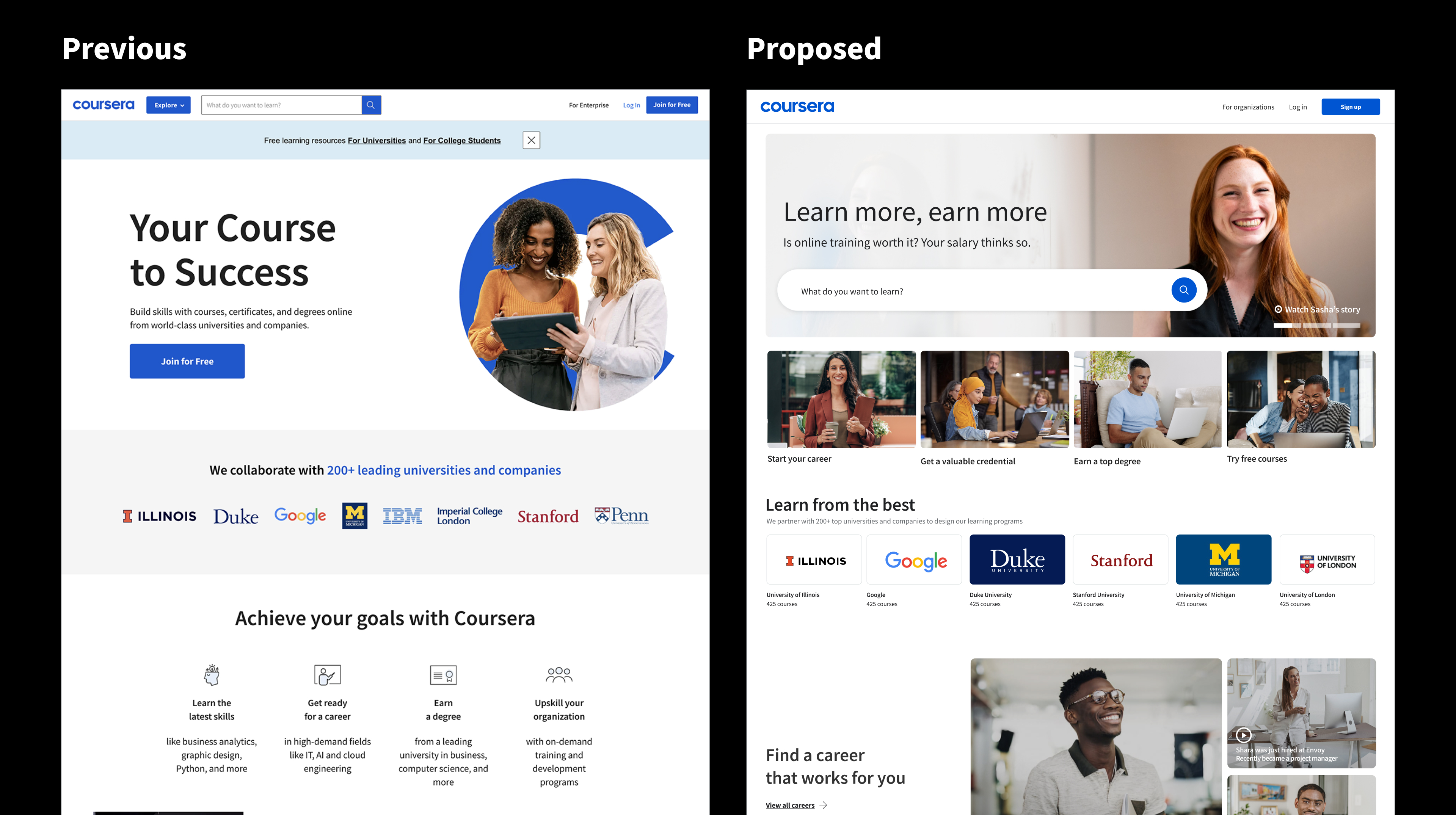
Logged Out Home Page
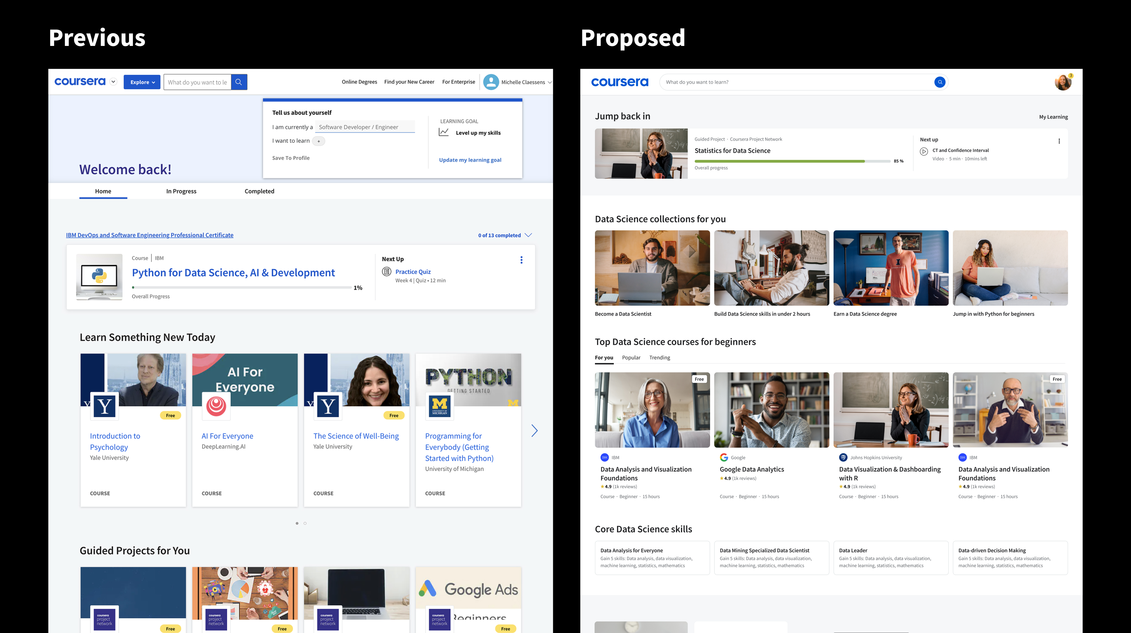
Logged In Homepage
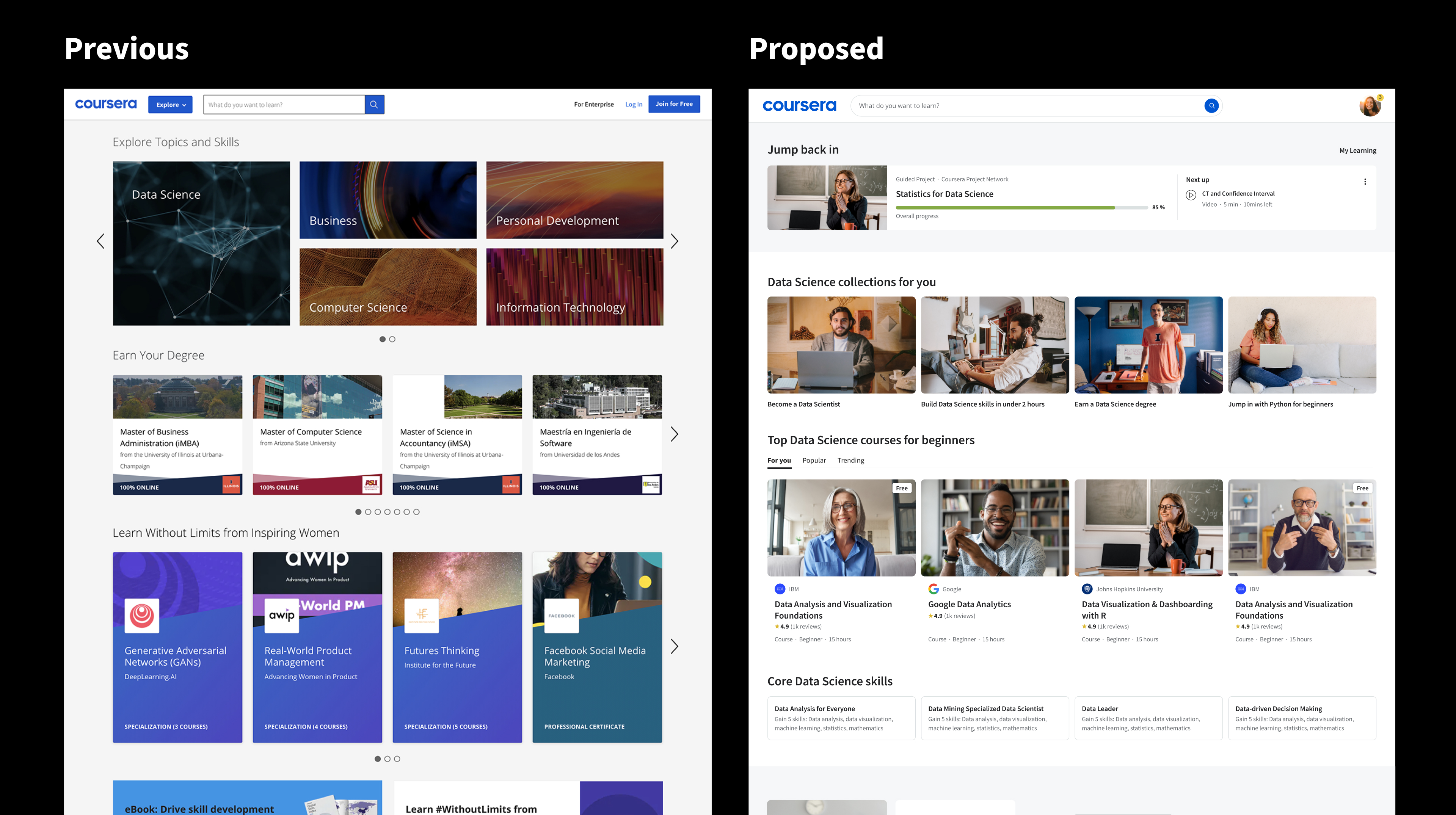
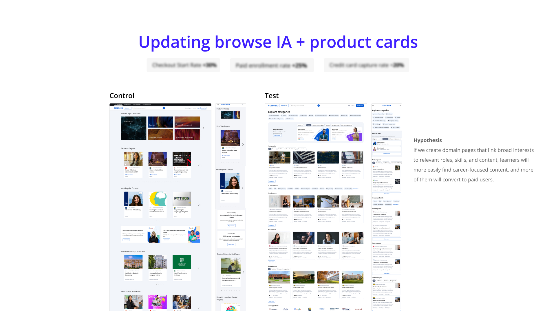
Browse Pages
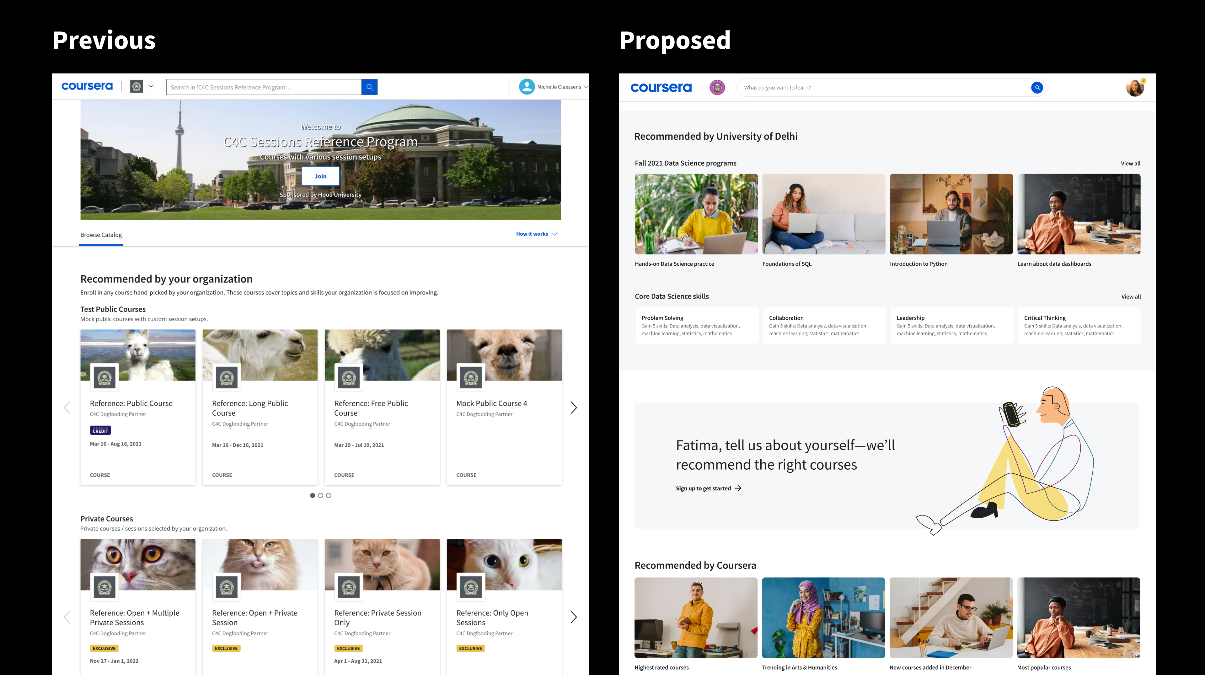
Campus Students Homepage
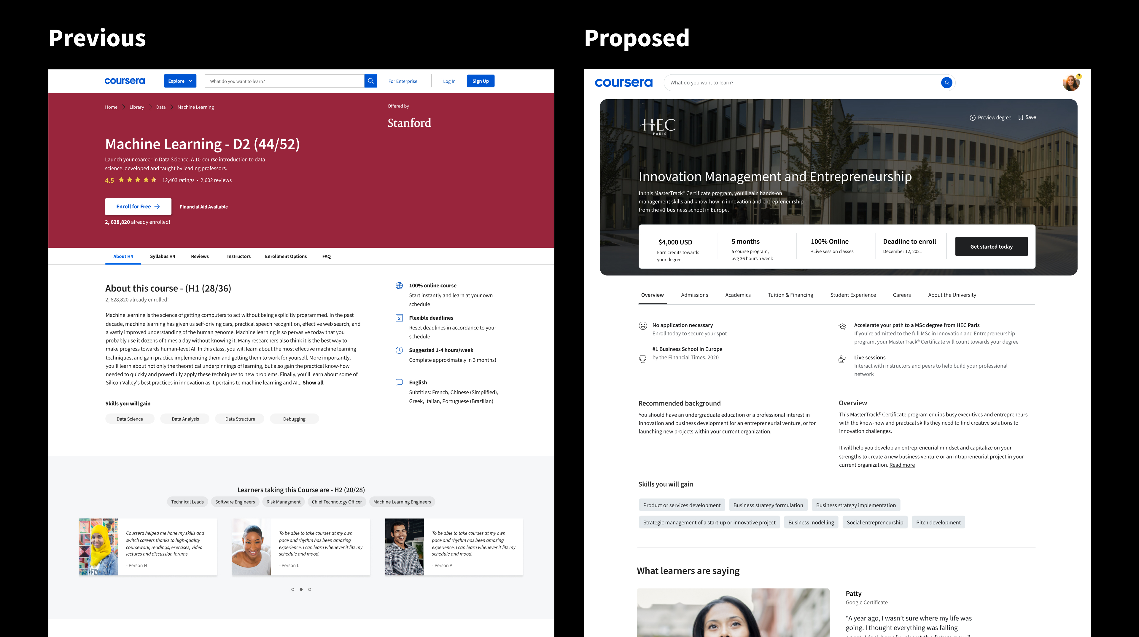
Degree Hub
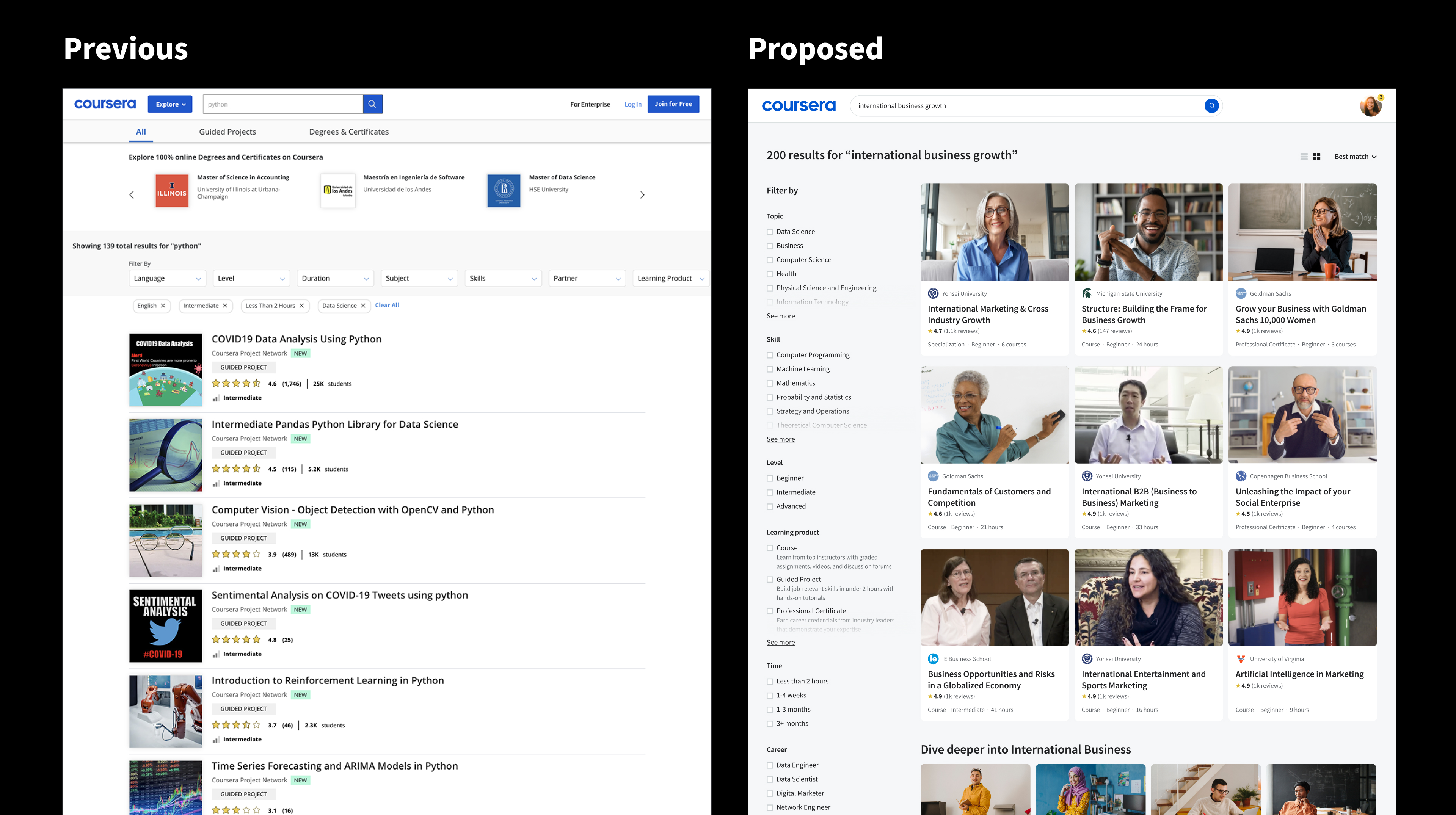
Search
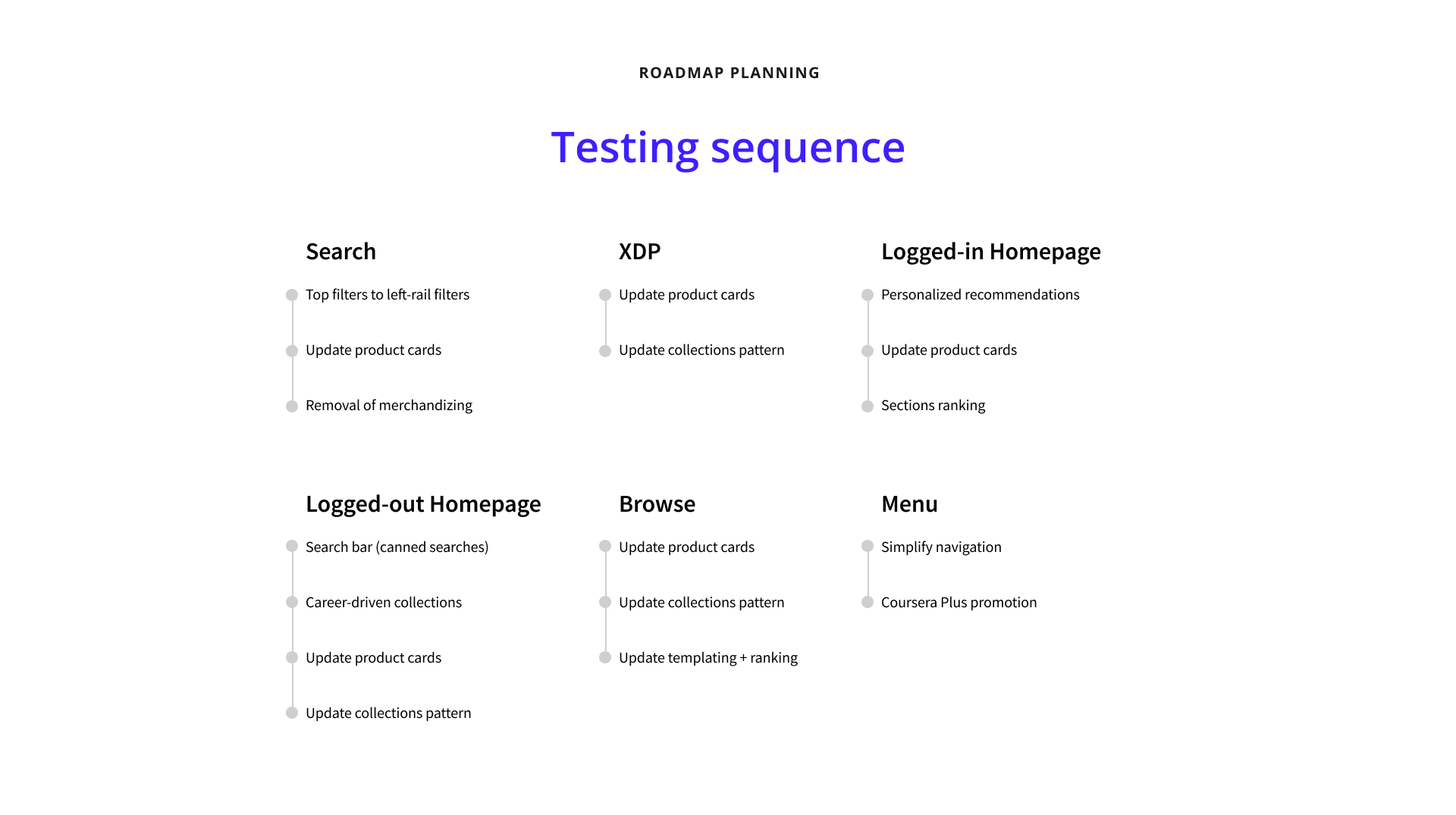
Testing sequence
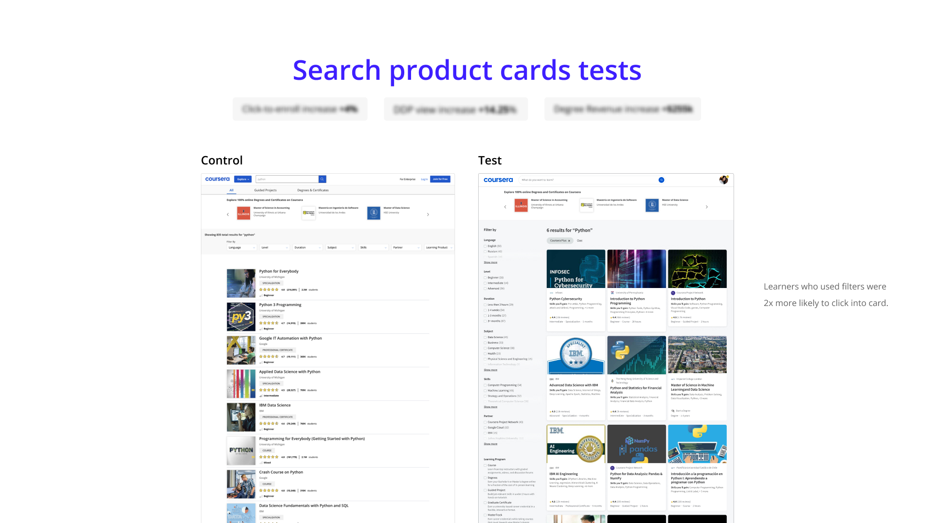
Test 1
Interactive Product Card demo
Test 2
Test 3